Rivian Blue
Member
- Joined
- Nov 14, 2024
- Messages
- 208
- Reaction score
- 17
- Rivian
- R1S Rivian Blue
Hey, has anyone else noticed how the full-size buttons on Rivian’s control screen make you scroll way more than needed? I get that it’s probably their design vibe, but it feels clunky when you’re just trying to tap something quick.
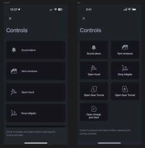
If they switched to smaller, half-width buttons with the icon and text stacked, it’d be so much smoother. You’d see more options at once, no scrolling, and the screen would look cleaner too.
The new charge port button might need a slight tweak to fit, but I threw together a rough sketch, and it feels way better. Anyone else annoyed by the constant scrolling on that screen? I’m curious if you guys think smaller buttons with stacked text would make things easier or if you’re cool with how it is now.

